Liebherr Australia
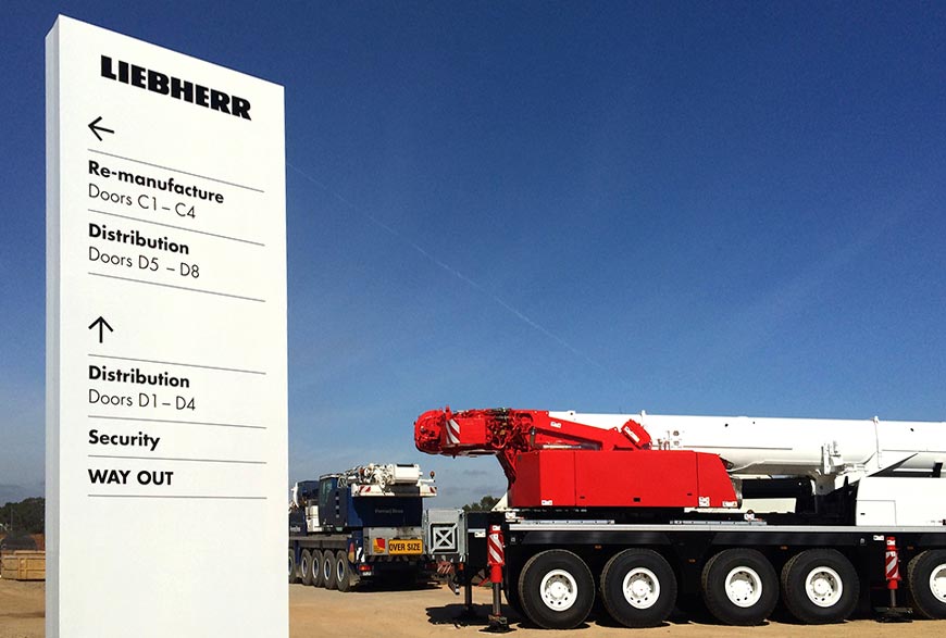
Elevation were responsible for creating the site signage masterplan for Liebherr Australia’s new $85m headquarters.
Working on an enormous scale with heavy machinery moving throughout the site, clarity was paramount. The design reflected the black and white brand adopted by Liebherr’s earth moving division and we established typographic rules for use across the kit-of-parts.
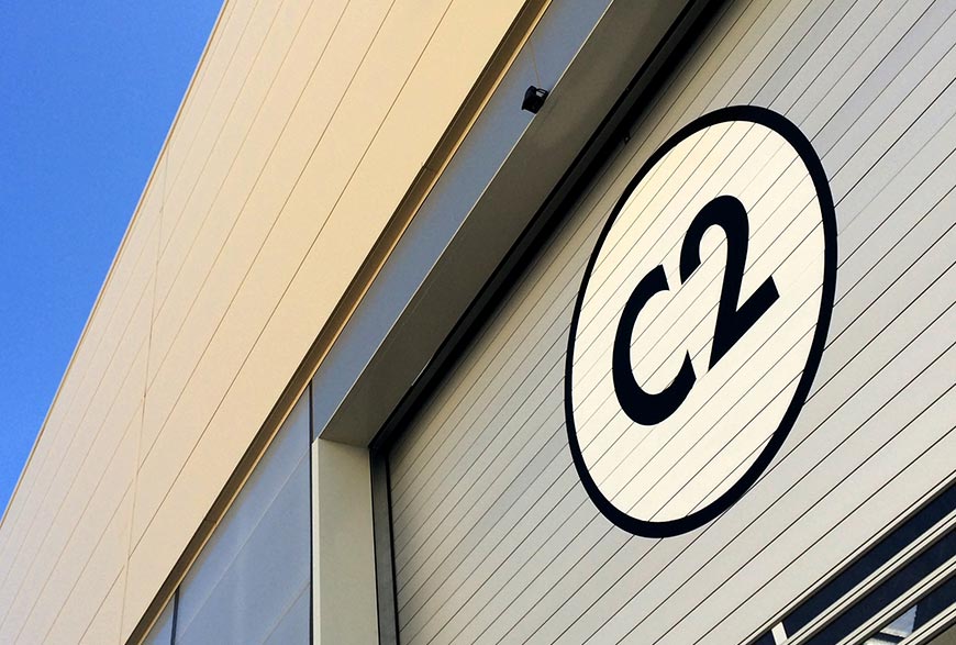
Highly visible building numbers where painted directly onto super-fast roller doors which are automatically opened upon approach.
The principals and design language developed has now been used as the benchmark for other satellite offices moving forward.
- / Signage + Wayfinding/
- / Interior Graphics
Client: Liebherr Australia
Date: 2012


